
Inviting color back home
- Foyra

- Mar 22
- 4 min read
Light a small lamp before you read this and look around the room as if you’ve just arrived.
There was a time when streets felt like conversations.
Soft yellow beside chalky blue. A deep red door that knew the sound of children running through it. Houses had voices. They spoke in pigment and peeling paint, in shutters and tiles warmed by sun.
Now, much of the world feels as though someone has quietly lowered the saturation. Gray. Beige. Muted white. Orderly buildings standing shoulder to shoulder, polite and silent. Safe.
The same hush has settled indoors. Our homes are clean. Polished. Correct. And often, strangely lifeless.
Rooms that photograph beautifully but feel like waiting rooms. Surfaces without the trace of hands. Shelves styled but untouched. Objects that seem temporary, as though they exist only as long as the signal holds.
Perhaps this shift is not only aesthetic. Perhaps it is about fear.
Color exposes. It tells stories. It takes a stance.
Neutrality protects. It blends in. It asks nothing.


In our pursuit of approval and efficiency, we may have left behind a little courage. A little play. A little warmth. But color has not disappeared. It is waiting. In the back of a cupboard. In the folds of a tablecloth. In the memory of a room that once felt alive.
And perhaps it is time to invite it back home.
Why color feels personal
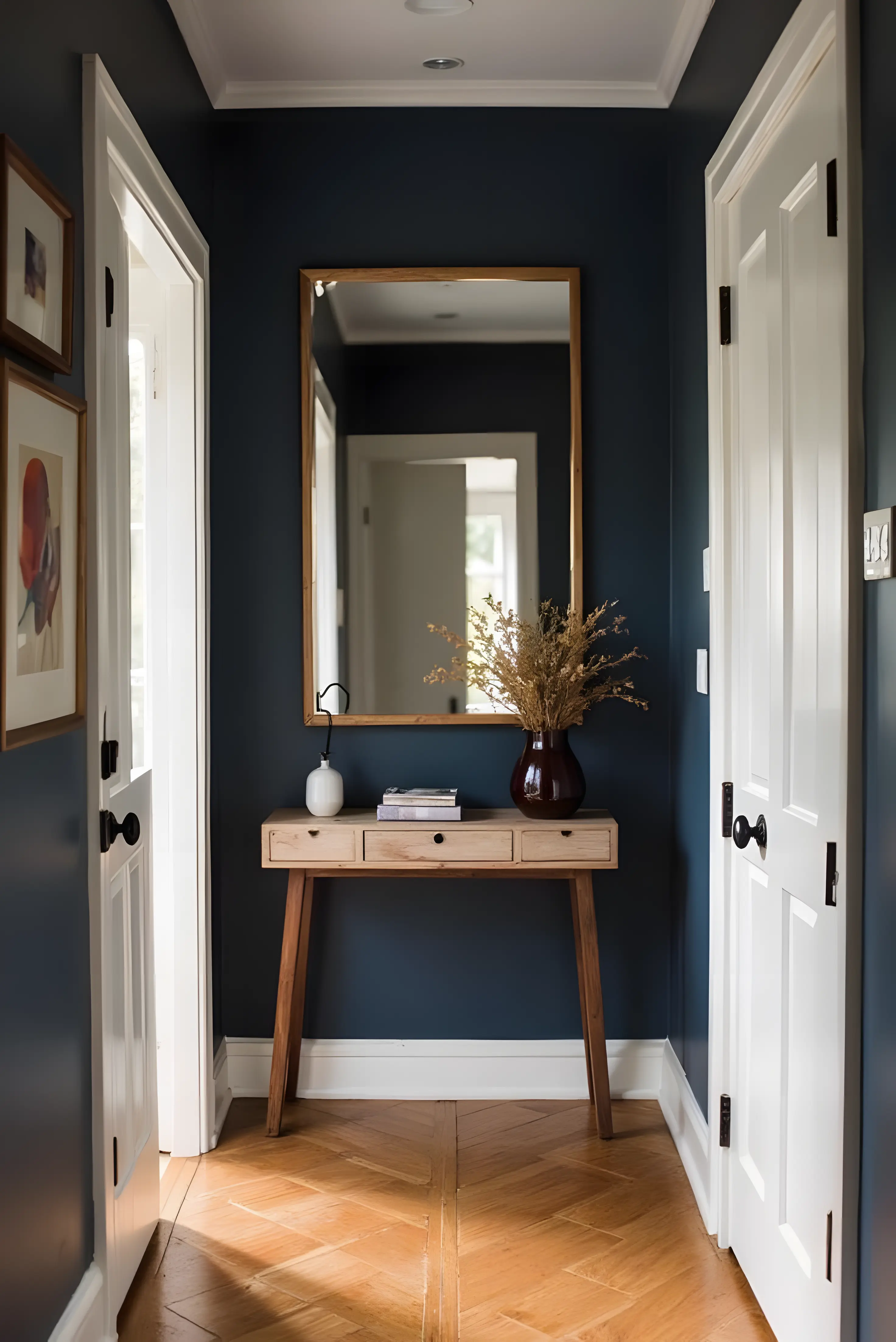
Color is not decoration. It is biography.
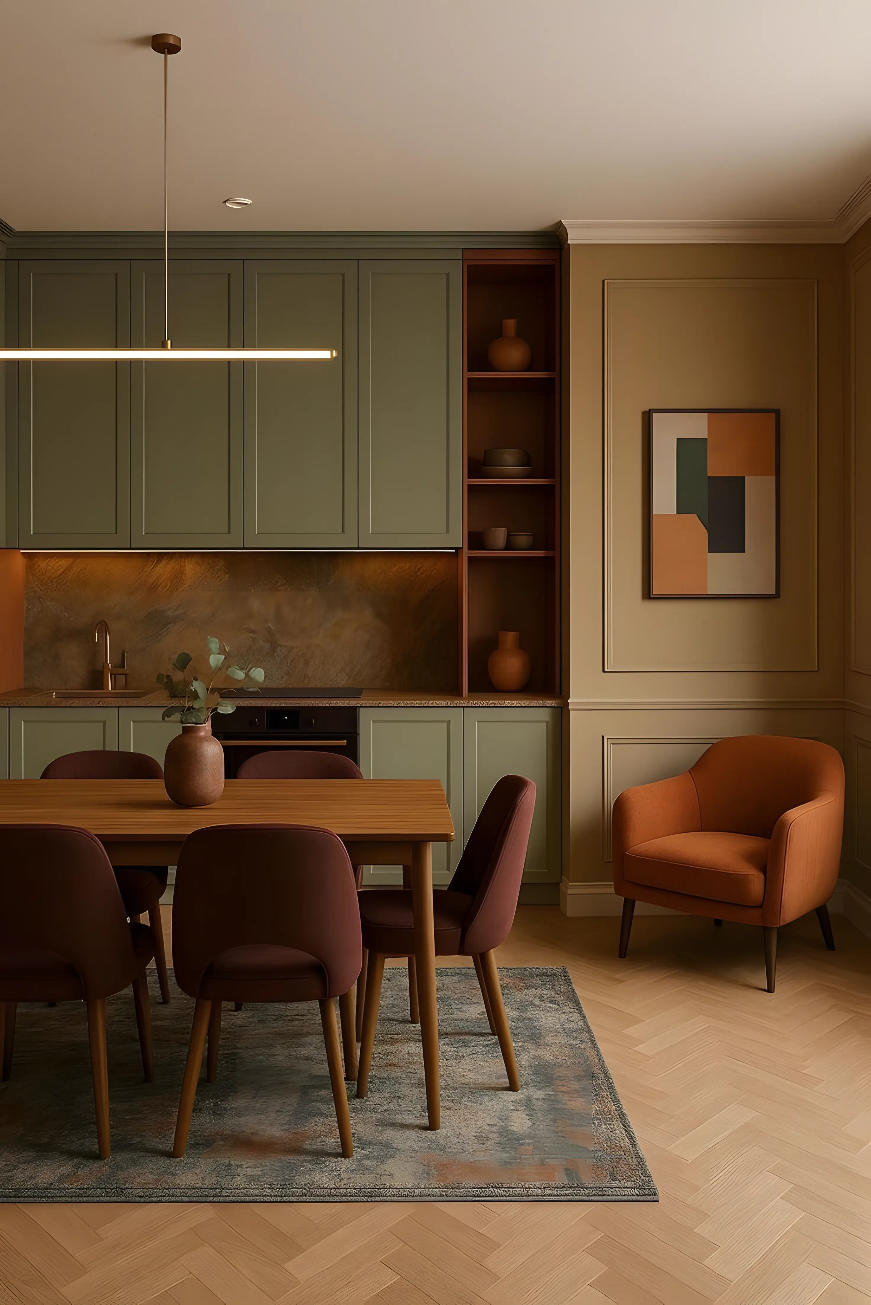
A kitchen with deep green walls feels different from one wrapped in pale gray. A faded red rug carries more than pattern: it holds footsteps, crumbs, morning light.
Color makes a home specific. It says: This is ours.
When we choose only what is universally liked, we often end up with spaces that belong to no one in particular. Beautiful, yes. But distant.
Inviting color back home begins with asking a quieter question: What shades feel like comfort to me?
Not what is trending. Not what photographs well. But what reminds you of warmth. Of childhood. Of a place where you once felt safe.
Start there.
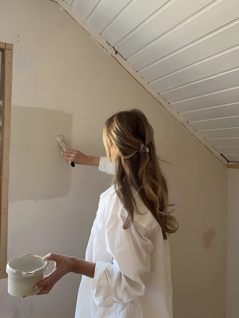
Begin with the smallest surface
Color does not require renovation. It requires intention.
Living tip
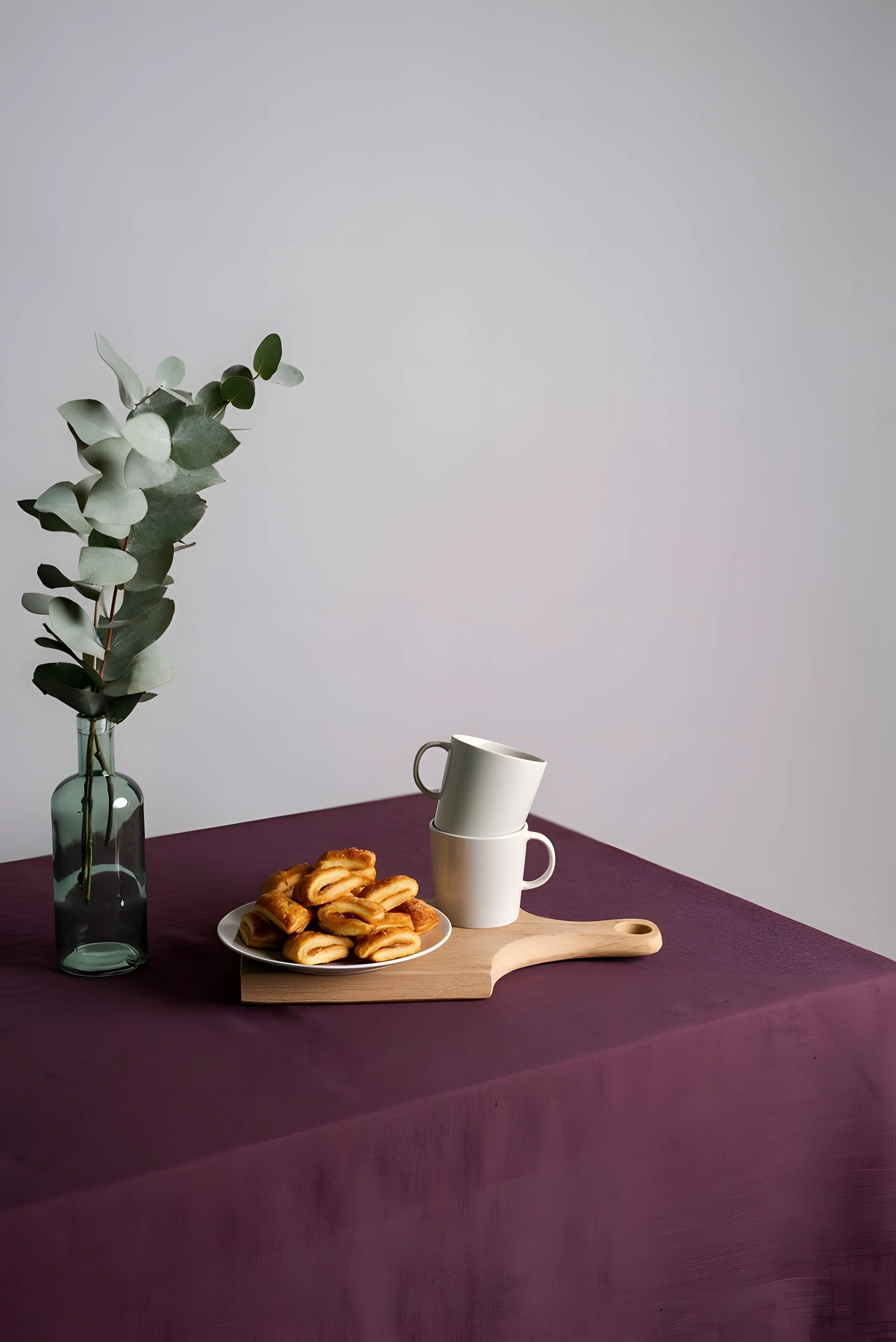
If your home feels pale and hesitant, begin gently. A single surface. A single object.
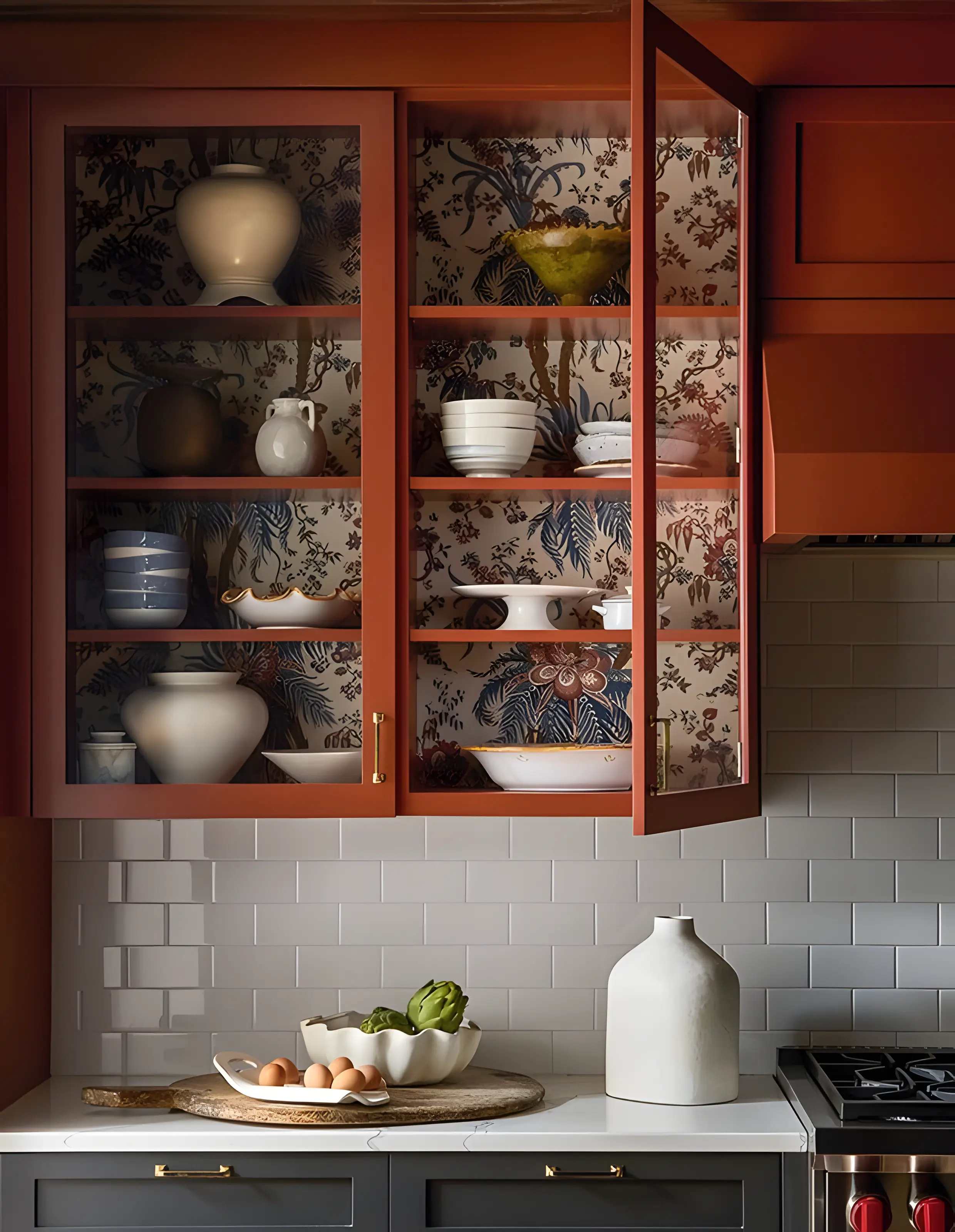
Paint the inside of a cupboard a muted blue or warm terracotta. A secret only you see when you reach for a plate.
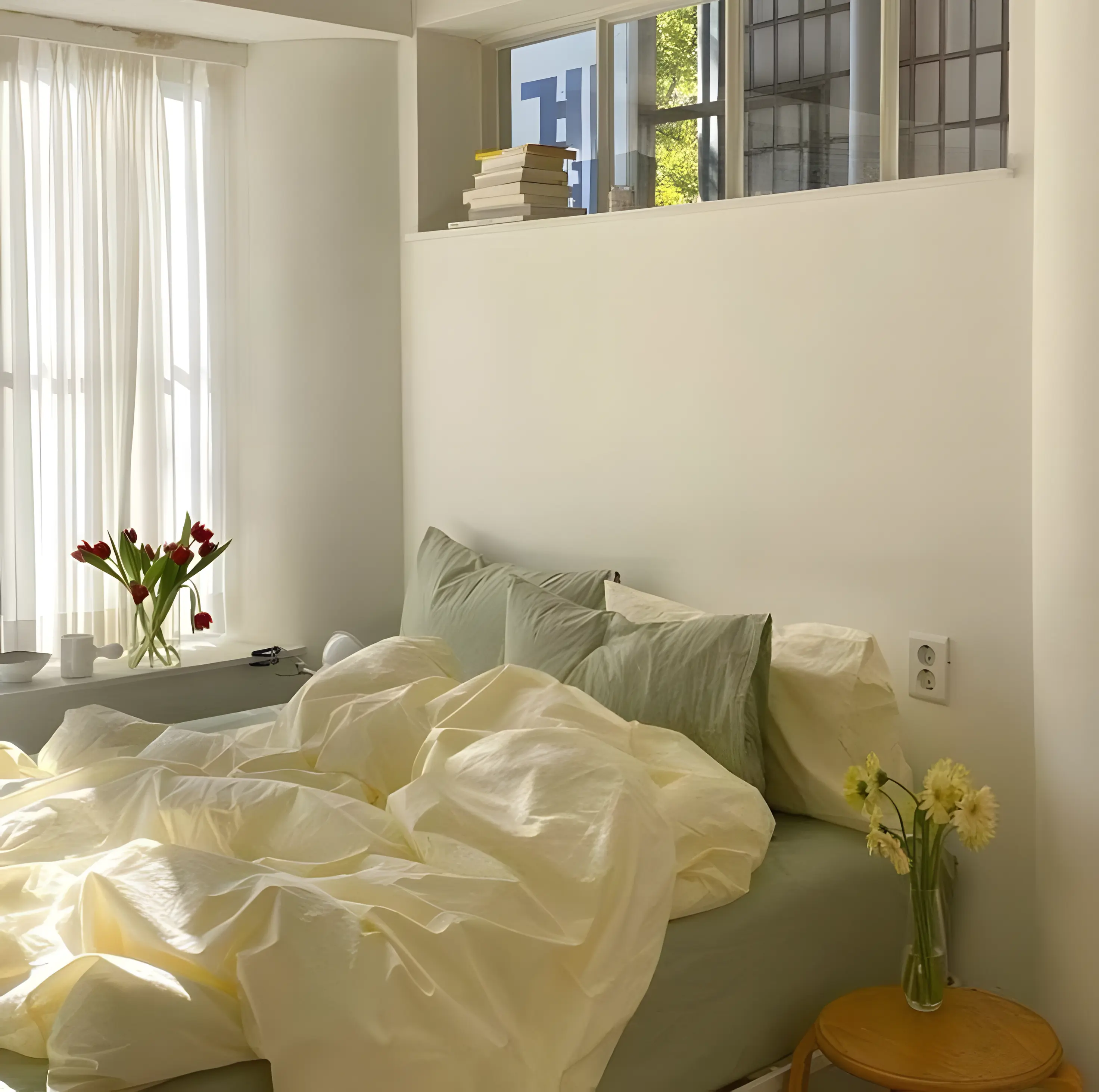
Replace a neutral cushion with one in washed mustard or deep plum.
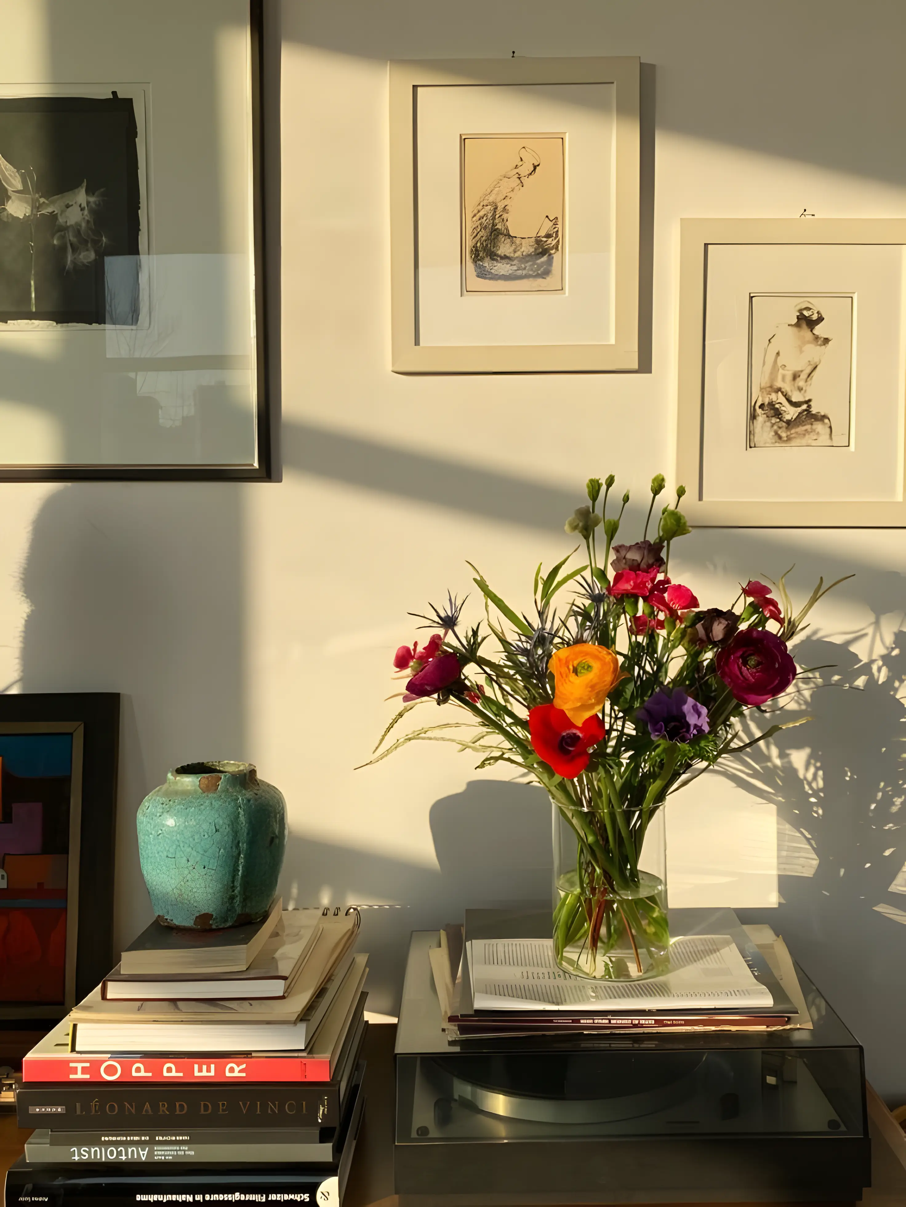
Choose a weekly colorful flower arrangement.
Lay a patterned cloth on the table, even on an ordinary Tuesday.
Frame a piece of art that carries real pigment, not just line.
These gestures are not loud. But they are alive.
When you introduce color in small rituals, it begins to feel less like a design decision and more like a way of living. Color becomes part of the rhythm of the day.
Let objects tell their stories
We often replace instead of repair. Upgrade instead of keep. But the objects that carry color beautifully are usually the ones that have stayed.
A wooden chair painted years ago and softened by time. A chipped ceramic bowl glazed in uneven blue. A woven blanket whose threads have faded into gentler tones.
These pieces might not match perfectly, but they belong.
Before buying something new, look at what you already have. Could a forgotten side table be painted in a shade that feels bold but grounding. Forest green, dusty rose, warm ochre? Could a simple shelf hold a row of mismatched, colorful spines instead of neutral covers turned inward?
Color feels most authentic when it grows from what you already love.
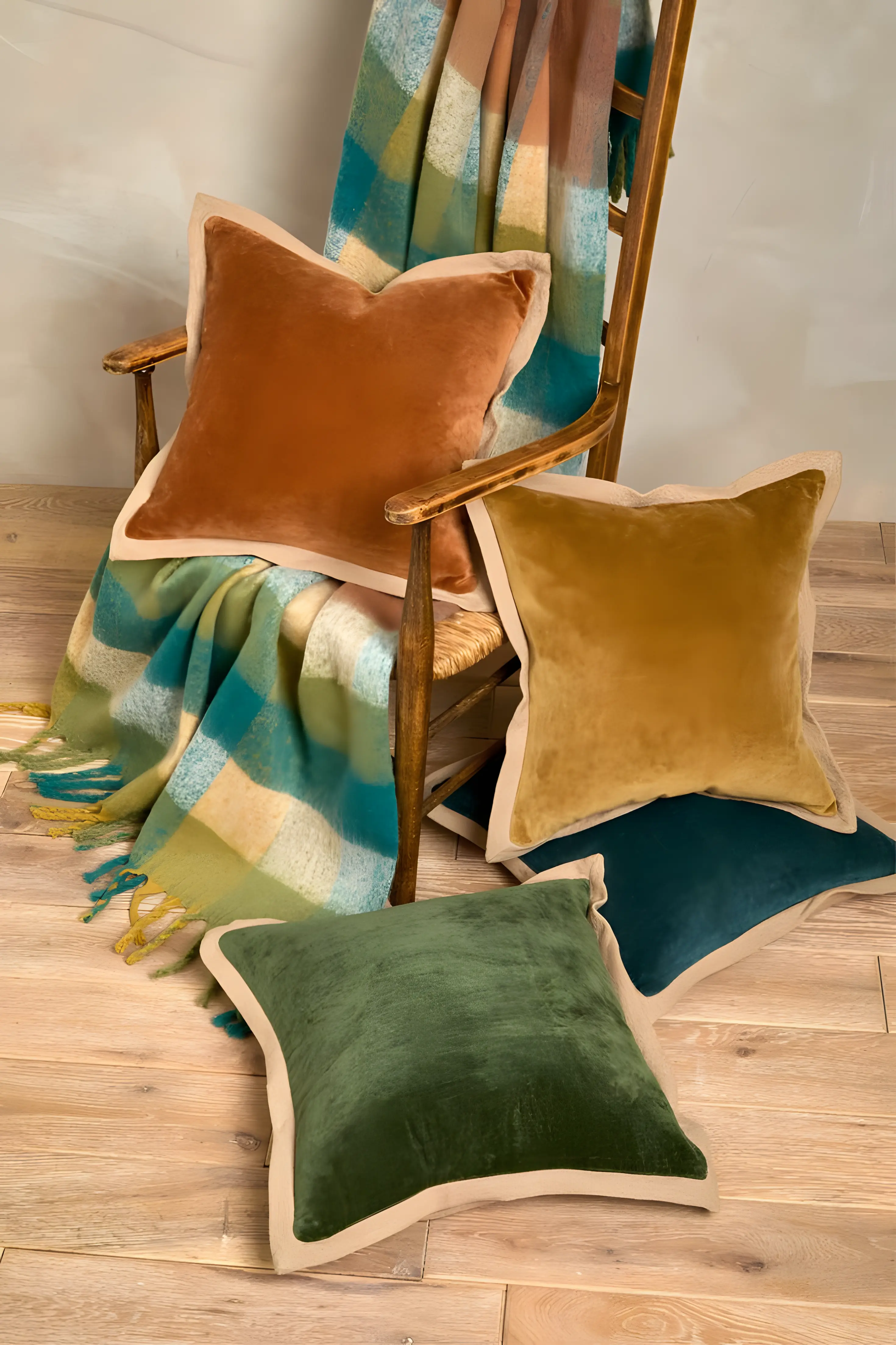
Create seasonal color rituals
Color can shift with the light.
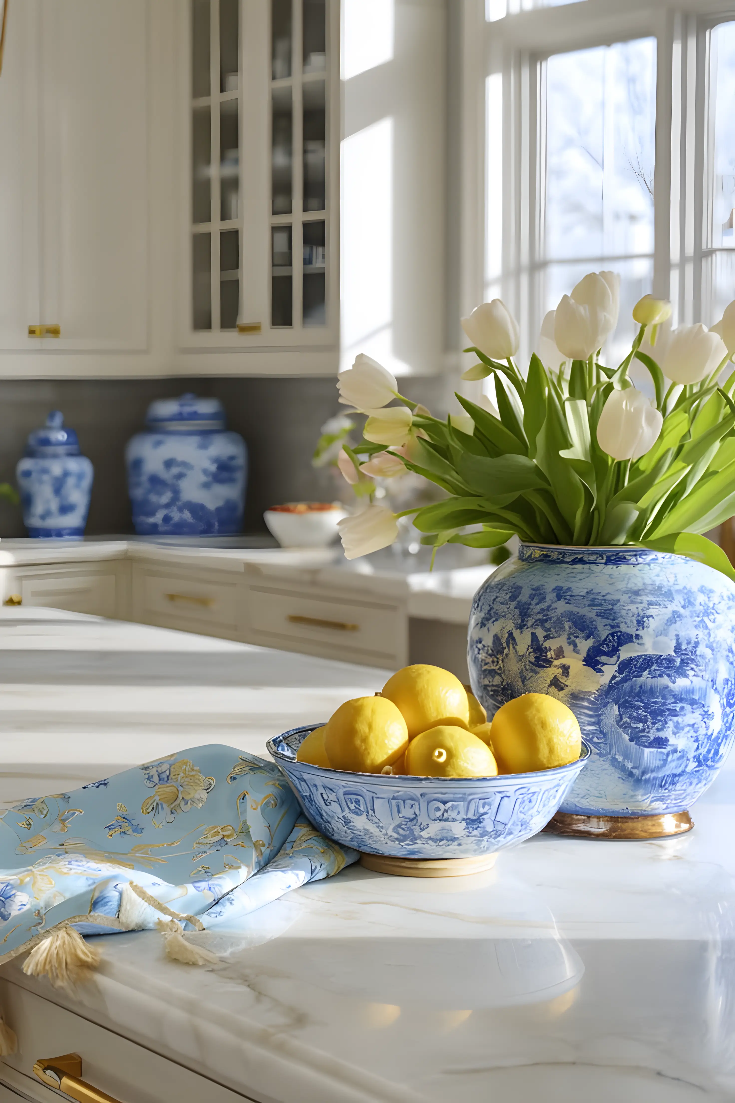
In early spring, bring in soft greens and pale yellows: a bowl of lemons on the counter, fresh herbs in small pots, linen napkins in gentle tones.
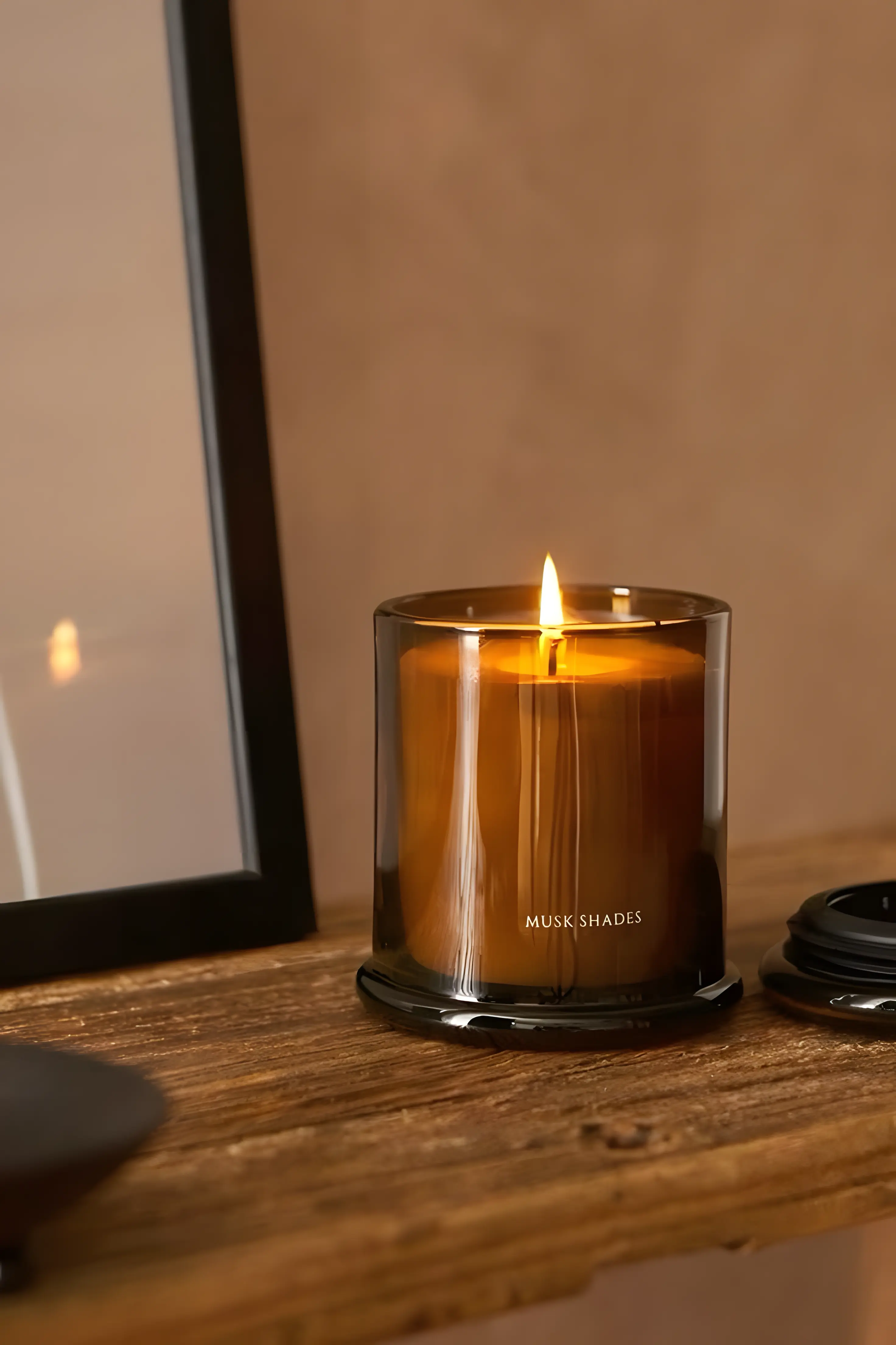
In autumn, lean into rust, plum, deep brown: a thicker tablecloth, candles that cast amber light.
In winter, perhaps a dark blue wall or velvet cushion that holds the evening close.
These are not trends. They are responses to the season.
Living tip
Make it a ritual.
At the start of each new chapter of the year, choose one color to highlight. Move objects around. Swap textiles. Rearrange books so that certain hues come forward.
In doing so, you remind yourself that a home is not static. It breathes and evolves.
Courage in the visible
The hardest part is not choosing the color. It is allowing it to be seen.
A painted front door. A wall that dares to be more than off-white. A bright lamp in an otherwise quiet room.
There is vulnerability in standing out, even within your own four walls. But a home is not a showroom. It is a container for your days.
Living tip
If a certain shade feels almost too much, ask yourself: Does it make the room warmer? Does it make me linger? Does it hold the light differently?
If the answer is yes, that is reason enough.
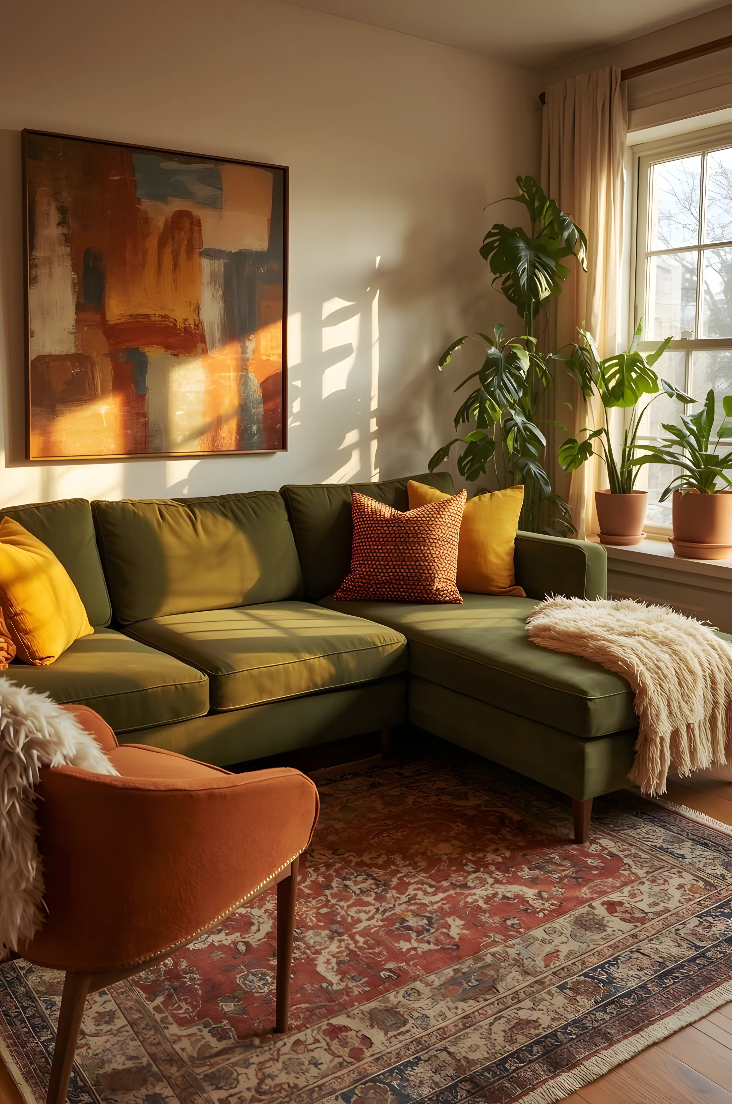
The lived-in home is thoughtful, calm, grounded. Color works best when it rests against simplicity:
A richly painted wall beside plain linen curtains.
A patterned rug under a simple wooden table.
A bright ceramic bowl on an uncluttered shelf.
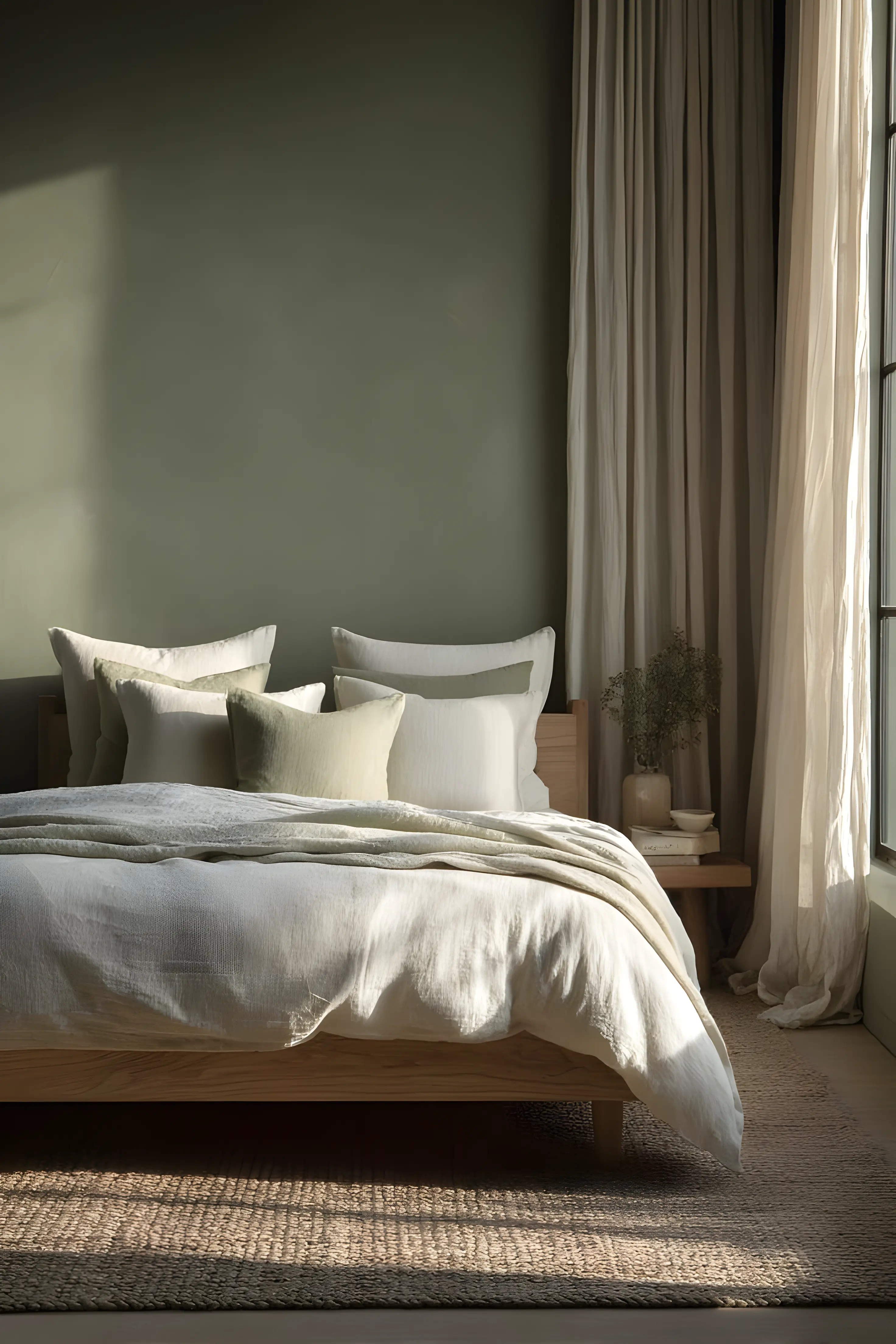
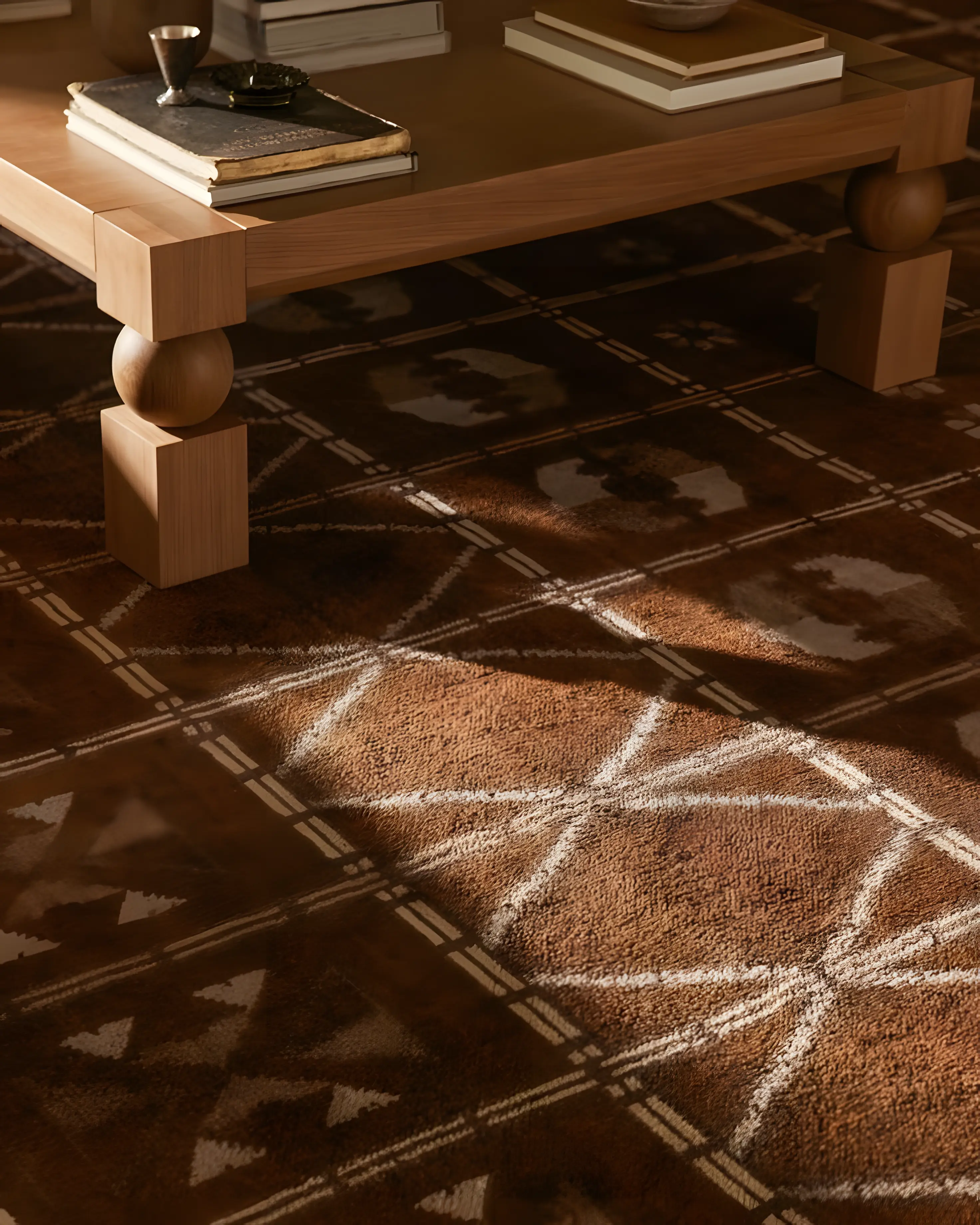
Contrast allows color to breathe. Let there be quiet around it.
The color that lasts
The world has not turned black and white. We have simply chosen restraint.
But the moments that stay with us are rarely neutral.
The red of tomatoes sliced on a summer afternoon. The golden light at the end of the day. The blue of evening settling through an open window.
These are not loud colors. They are lived colors.
Invite them in. Through paint, through fabric, through objects that mean something. Through courage, in small doses.
And when you step into your home at the end of the day, let it feel less like a waiting room and more like a welcome, because it is yours.


Comments